Fall Paint Color Palette: 5 Shades That Work Together
September 10, 2026
Our Fall Paint Color Palette
Picking one paint color is easy. Picking five that actually work together is the harder job, and it’s the one we did for you. This fall paint color palette is built around warm, grounded tones that coordinate across a whole house, not just a single wall.
Use all five across different rooms, or pull just one for a door or accent wall. Either way, they’re designed to sit next to each other without a fight.
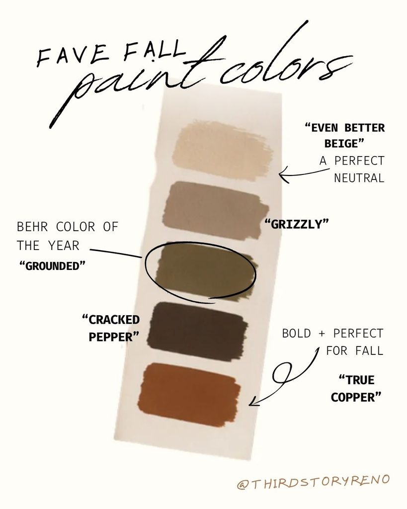
The Palette
“Grounded” — Behr’s Color of the Year
A muted olive green that reads more sophisticated than seasonal. This is the anchor of the palette, deep enough to feel intentional on a full wall, versatile enough to work as a cabinet or door color too. Pairs naturally with brass hardware and warm wood tones.
“Even Better Beige” — The Perfect Neutral
Every palette needs a quiet color, and this is it. A warm, soft beige that acts as a background for the bolder tones in this lineup. Use it on trim, ceilings, or as the main wall color in a room where you want the furniture and decor to lead.
“Grizzly” — The Warm Greige
Right between beige and green, “Grizzly” is the color that makes the rest of the palette feel cohesive. It’s a warm greige that works almost anywhere, hallways, bathrooms, secondary bedrooms, and bridges the neutral and the bolder tones without competing with either.
“Cracked Pepper” — The Deep Neutral
A near-black with warmth underneath it, not a flat, cold black. This is the color for a front door, a built-in, or a single accent wall that needs real depth. It grounds the lighter tones in the palette and keeps the whole thing from feeling too soft.
“True Copper” — The Fall Statement
Bold, rust-toned, and built for the season. This is the color to use sparingly, a powder room, a piece of furniture, a single accent wall, somewhere it can do its job without overwhelming the room. It’s the one color in the palette that reads unmistakably fall.
How to Use a Coordinated Palette Like This
The point of a palette isn’t to use every color in one room. It’s knowing that whatever you pick from the set will work with whatever else is around it. A few ways to put this one to use:
- Paint an open floor plan in “Even Better Beige” and use “Grounded” on the kitchen island or built-ins
- Use “Grizzly” as your whole-house neutral and save “True Copper” for a single powder room
- Pair “Cracked Pepper” on a front door with “Grounded” shutters for a cohesive exterior look
- Layer all five across a multi-room renovation so each space feels distinct but connected
A fall paint color palette like this one takes the guesswork out of choosing.
Pick your anchor, pick your accent, and trust that the undertones already line up.
Shop the Full Palette ↴
♢ “Grounded” by Behr (Color of the Year): https://thehomedepotcreator.sjv.io/3kqVJk
♢ “Even Better Beige” by Behr: https://thehomedepotcreator.sjv.io/5kDX53
♢ “Grizzly” by Behr: https://thehomedepotcreator.sjv.io/Gb4AK9
♢ “Cracked Pepper” by Behr: https://thehomedepotcreator.sjv.io/aN9BOo
♢ “True Copper” by Behr: https://thehomedepotcreator.sjv.io/VOvLxM
This post contains affiliate links. If you shop through them, we may earn a small commission at no extra cost to you.

Be the first to comment